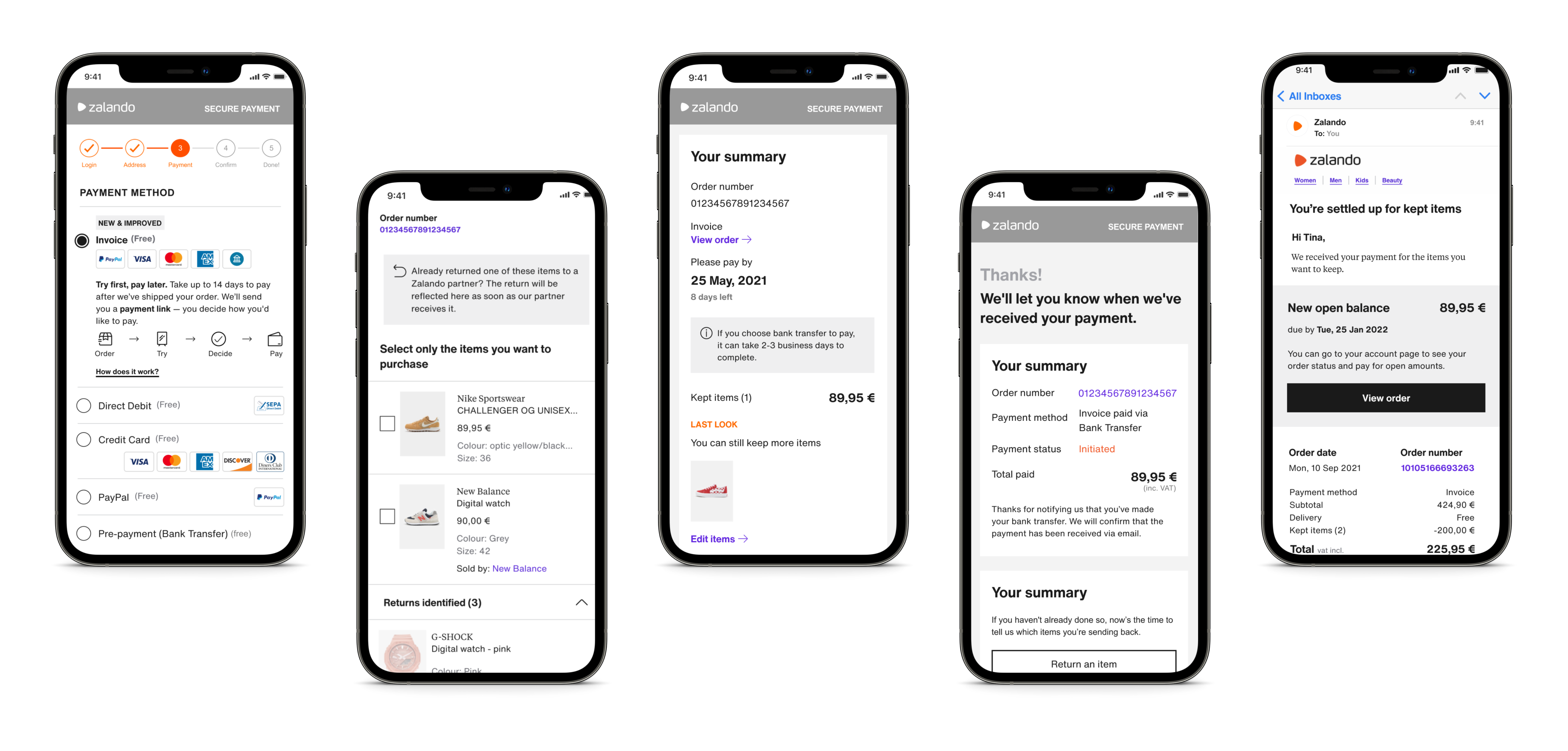
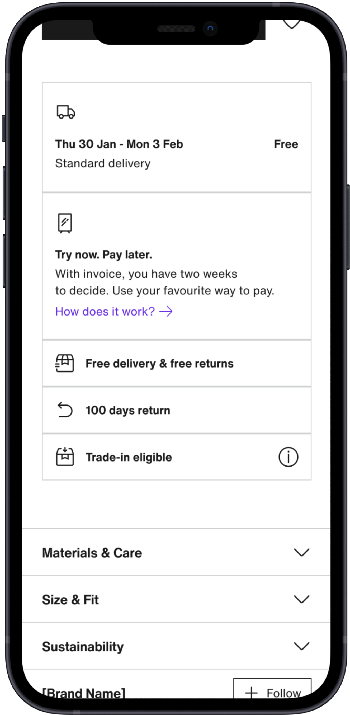
Validate the size and fit of fashion items before you pay for them. Free shipping and returns. Only pay for what you keep.

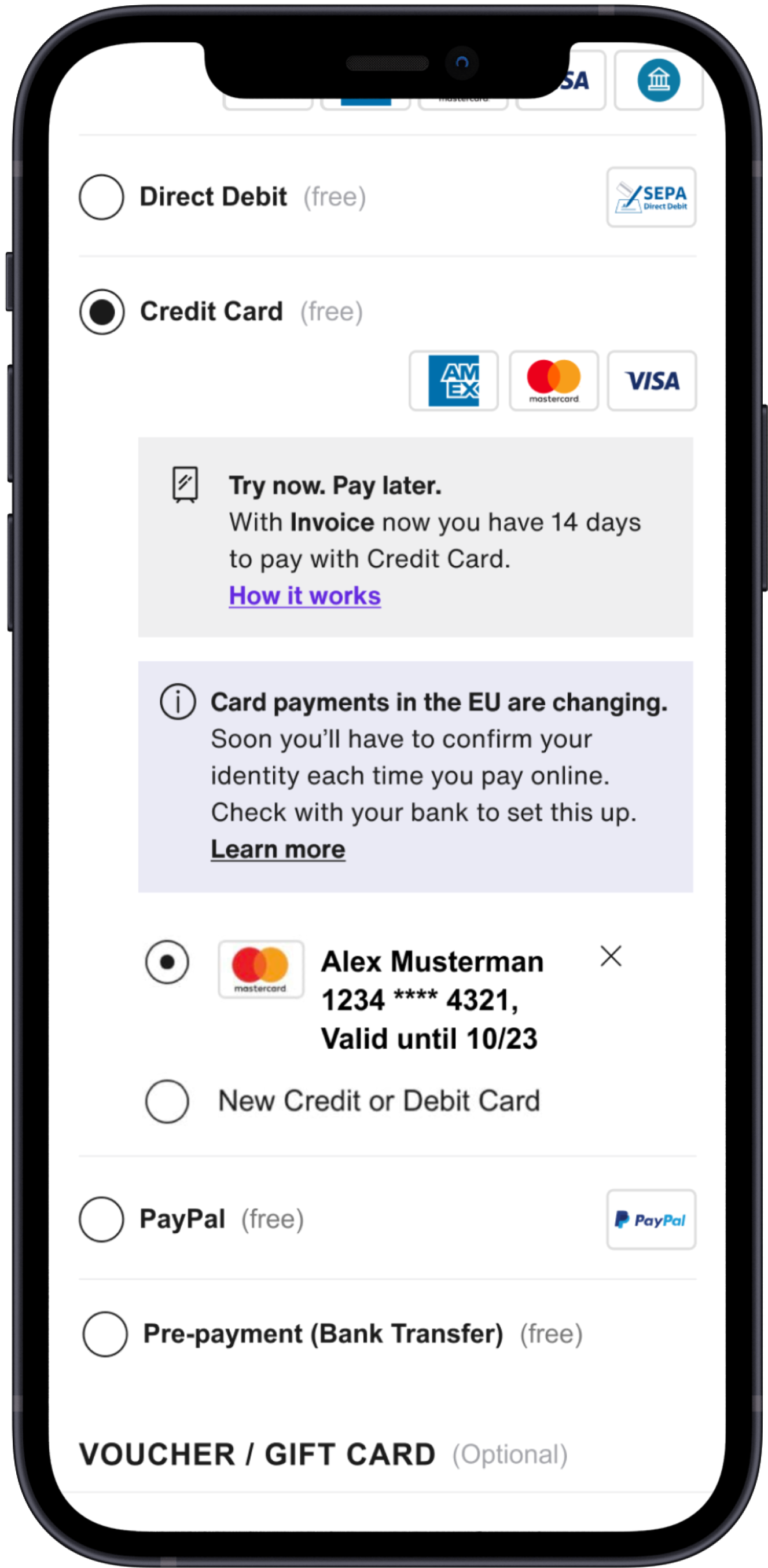
BNPL stands for Buy Now, Pay Later, a payment method that allows customers to place an order and pay only after trying on the items.The new BNPL 2.0 solution aimed to provide a frictionless post-purchase experience, enabling customers to easily access all payment-related information in one place, including the updated payable amount after partial returns.
From a business perspective, the goals were to reduce overdue payments, and to encourage customers to complete their payments via bank transfer within the BNPL flow rather than using external methods such as credit cards or PayPal.
Team Structure
Product
Managers
Business
& Growth
User
Researchers
Content
Designers
Different
teams
Diary Study
To understand customers’ real-time behavior and decision timing for payments, we conducted a diary study with 8 participants over one week. It helped us identify when users were most likely to make or postpone a payment, which later shaped the reminder timing logic
Survey (x3)
To validate the diary study results and confirm whether those behavioral patterns scaled across markets, we ran a follow-up survey. The findings confirmed the same evening decision peak and helped us quantify how often reminders actually influenced payment completion.
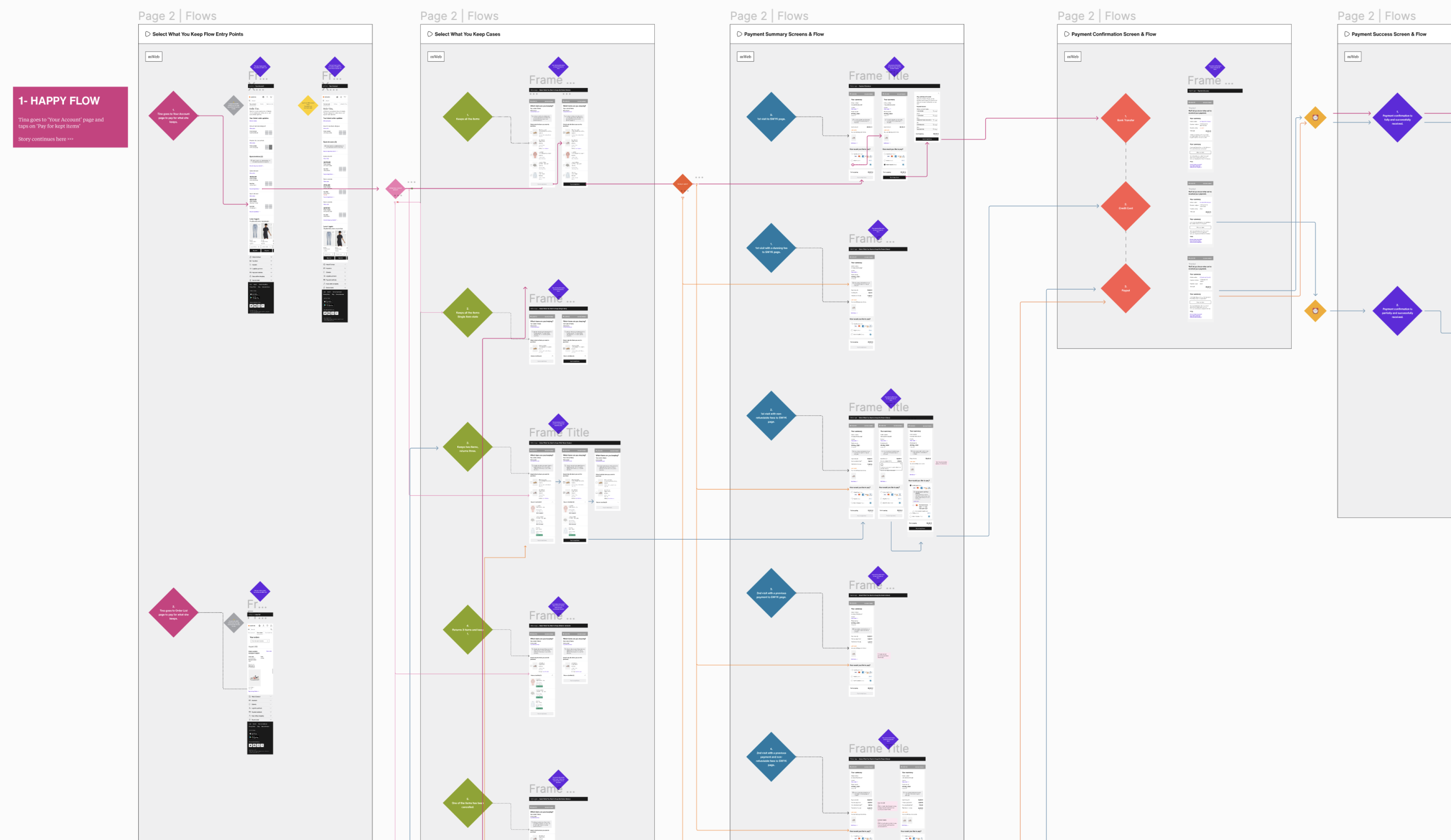
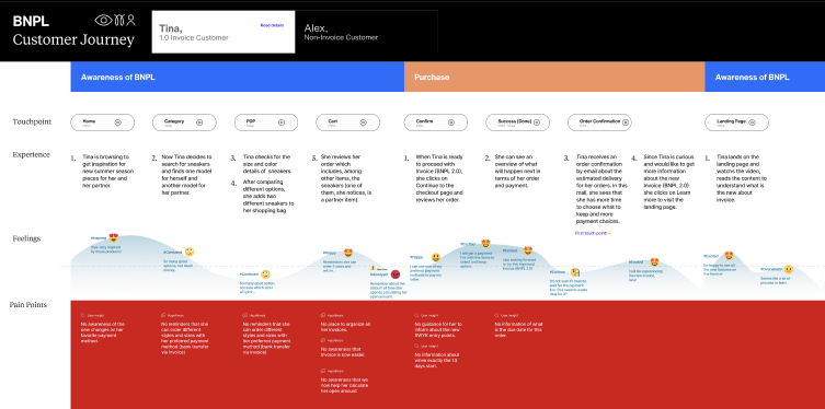
Customer Journey Map
An interactive user journey map was designed in order to see all scenarios and share them with the necessary units, together with all the data obtained.
First Click Test
A first click test was conducted to understand how well this payment method was understood in the Belgian market.
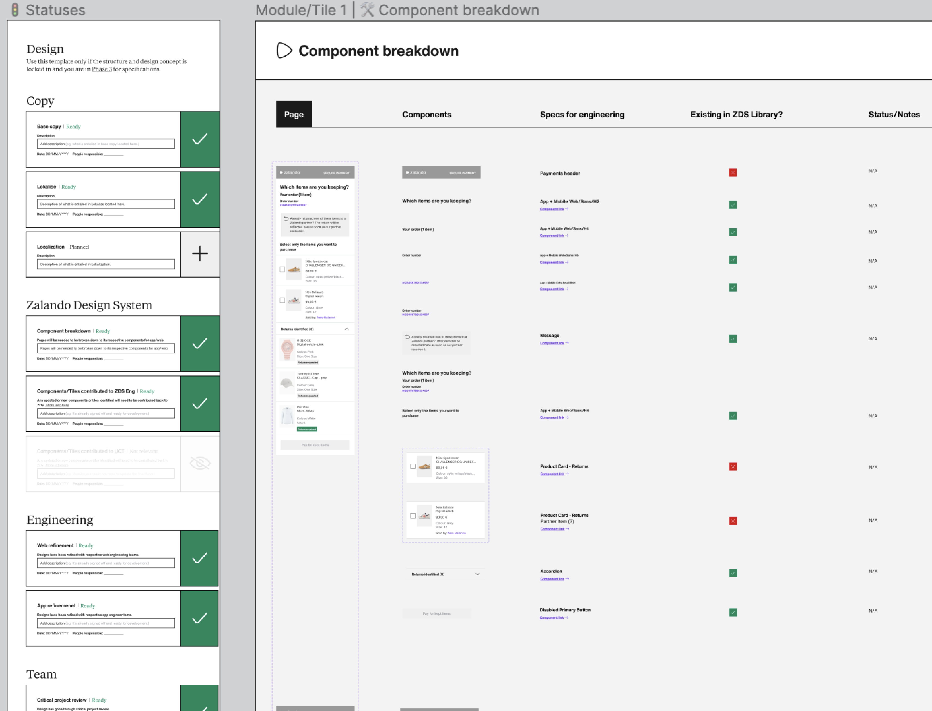
Design System
A component system was created by aligning the designs with the Zalando Design System design library.
A/B Test
Before the service goes live, it was submitted to 3 different control groups for A/B testing for the German market.
#Discover
#Insight
Situation
User test preparations have been started to test our first concept solution proposals.
Tasks
Some of my duties; Creating a moderation documents consisting of test contents, a note-taking page, preparing realistic prototypes to initiate the test.
Activities
I joined the tests as a prime observer to take notes and synthesize them with the product team.
Result
After the test sessions, we had a half-day workshop to analyze the results. By using this data, I've also created a test report.
Participants
Germany
🇩🇪
Others
🇪🇺
Invoice
📩
CC
💳
Paypal
📲
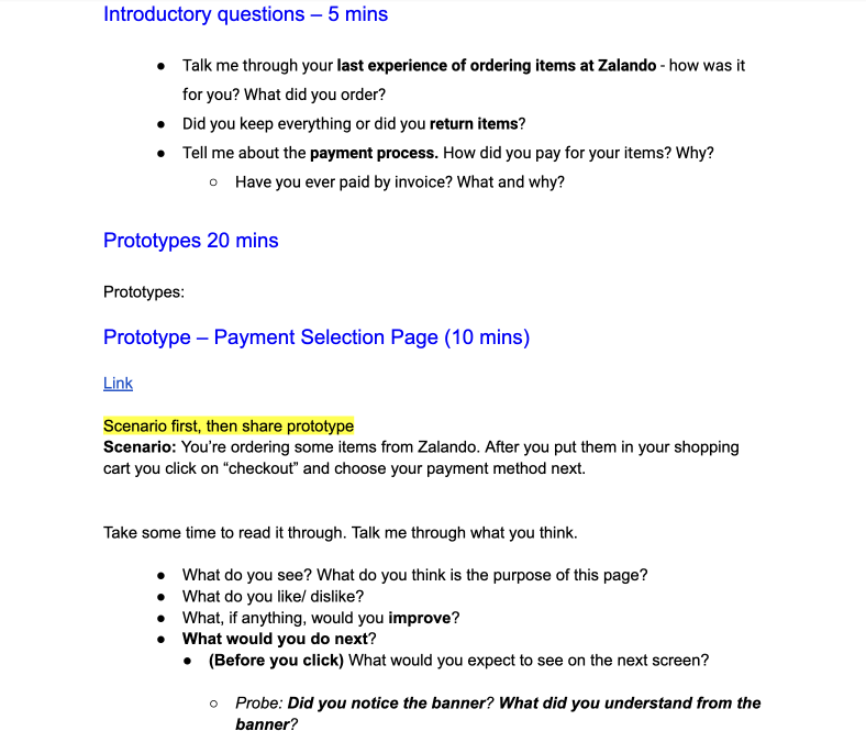
Moderation Guide
To use as a guideline during the test sessions, I've created the moderation guide containing the test scope and the questions with the support of the user researcher.
Designed
Screen
Insights of
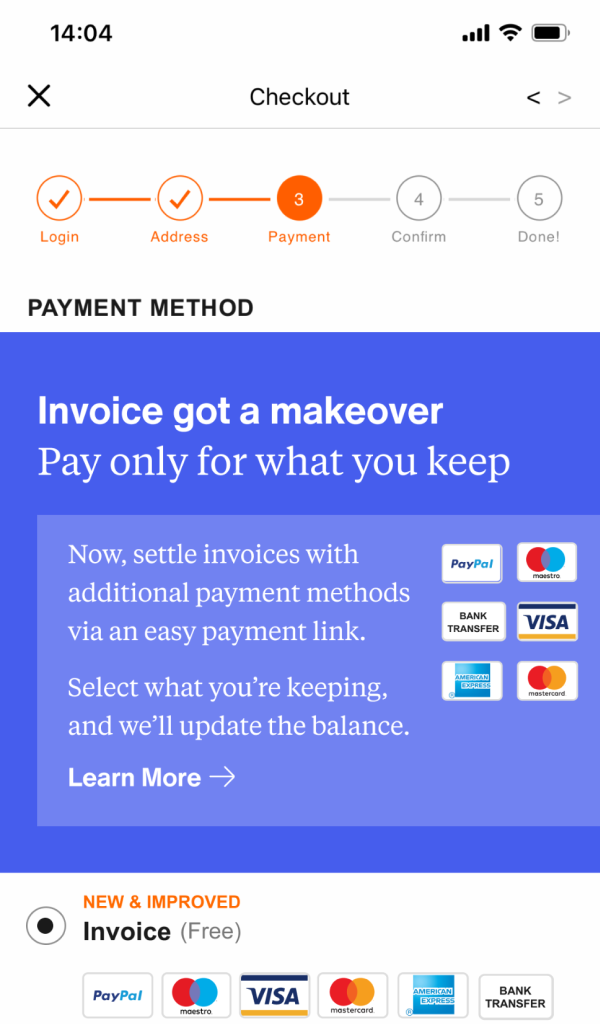
Noticing the banner
Virtually 2/6 users noticed the blue banner.
Message of the banner was not understood.
At least 4 users mentioned that the content of the banner is too repetitive.
Key
Quotes
💬
"I don't read because I know how it works, probably normal habit of acting."
P01
💬
"I wish I had more information about this payment link."
P03
💬
"The text of the banner is pretty long and text could be briefer."
P04
Note Taking Sheet
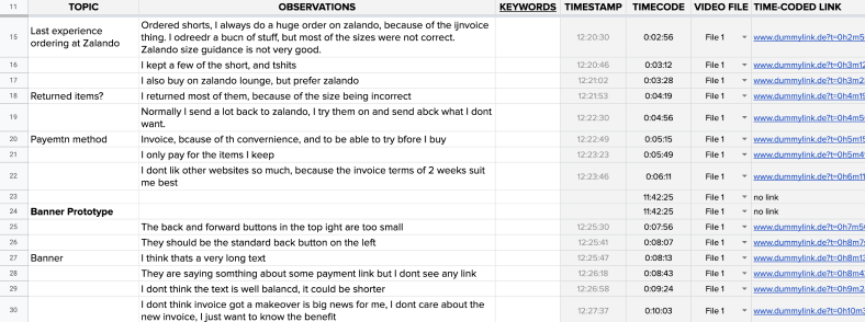
During each session, we took notes not to lose and time or information.
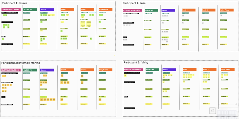
Participant Analysis Clusters
With the product team at the end of each day, we've jump into the mural board to start working on the test analysis.
Conclusion
We came up with a clear conclusion in order to understand which points to focus on and continue working on the improvements.
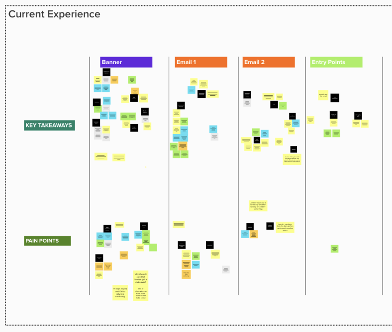
The banner did not perform as expected.
All the participants tend to go as in auto-pilot mode on the payments page. Therefore educating the customers is the most challenging topic.
The information of the new payment methods have understood by the invoice users faster than the non-invoice users.
The content on the banner has been found too repetitive.
The text on the banner found too long.
BNPL process with the iconography is the area that performed the best.
Email body context performed well.
BNPL process with the iconography is the area that performed the best.
First exploration
Updated exploration
#Research
#Discover
Situation
The product team wanted to have an inclusive survey to get more insights from the customers by following the real timeline.
Tasks
I've supported the team with creating the scope of the survey and the questions of it.
Activities
After the survey, we got the report and I've focused on the most important topics in creating an improvement plan.
Result
We've analyzed this report altogether also to understand the capabilities of the other teams, and continue working on the improvements.
Overview
This study has been made to understand the performance of the BNPL product of Zalando. 48 participants located in DE, BE and CH remotely.
Study Goals
The primary aim of the research is to rate and compare the BNPL payment method from a customer perspective.
The NPS score
Average star rating
out of 5
The Customer Effort Score (CES)
The Customer Satisfaction Score

Designed
Screen

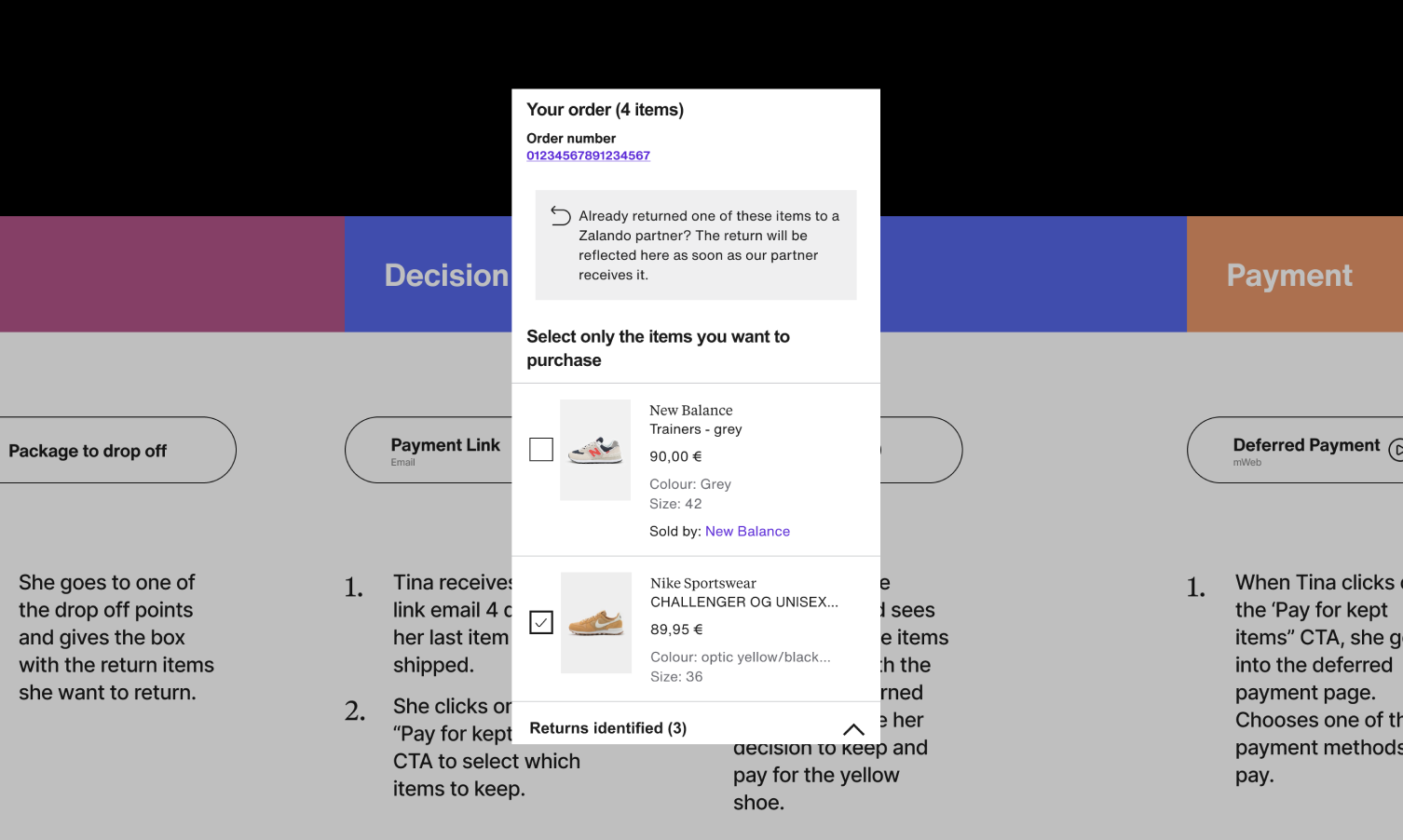
Survey Task
Partial Payment
Now please pay for 2 items of your order via credit card and rate how easy or difficult this was for you to do.
Summary
47 of the 48 (98%) found it easy or very easy to make a partial payment.
Key
Quotes
💬
"The application is pretty straightforward. Click the items you want to keep, click on the payment method and you are done."
P-BE
💬
"This part also worked very simple and intuitive. I liked extremely well that I can choose the items I want to keep from the list and then summarised transparently."
P-DE
Designed
Screen

Survey Task
Payment Link
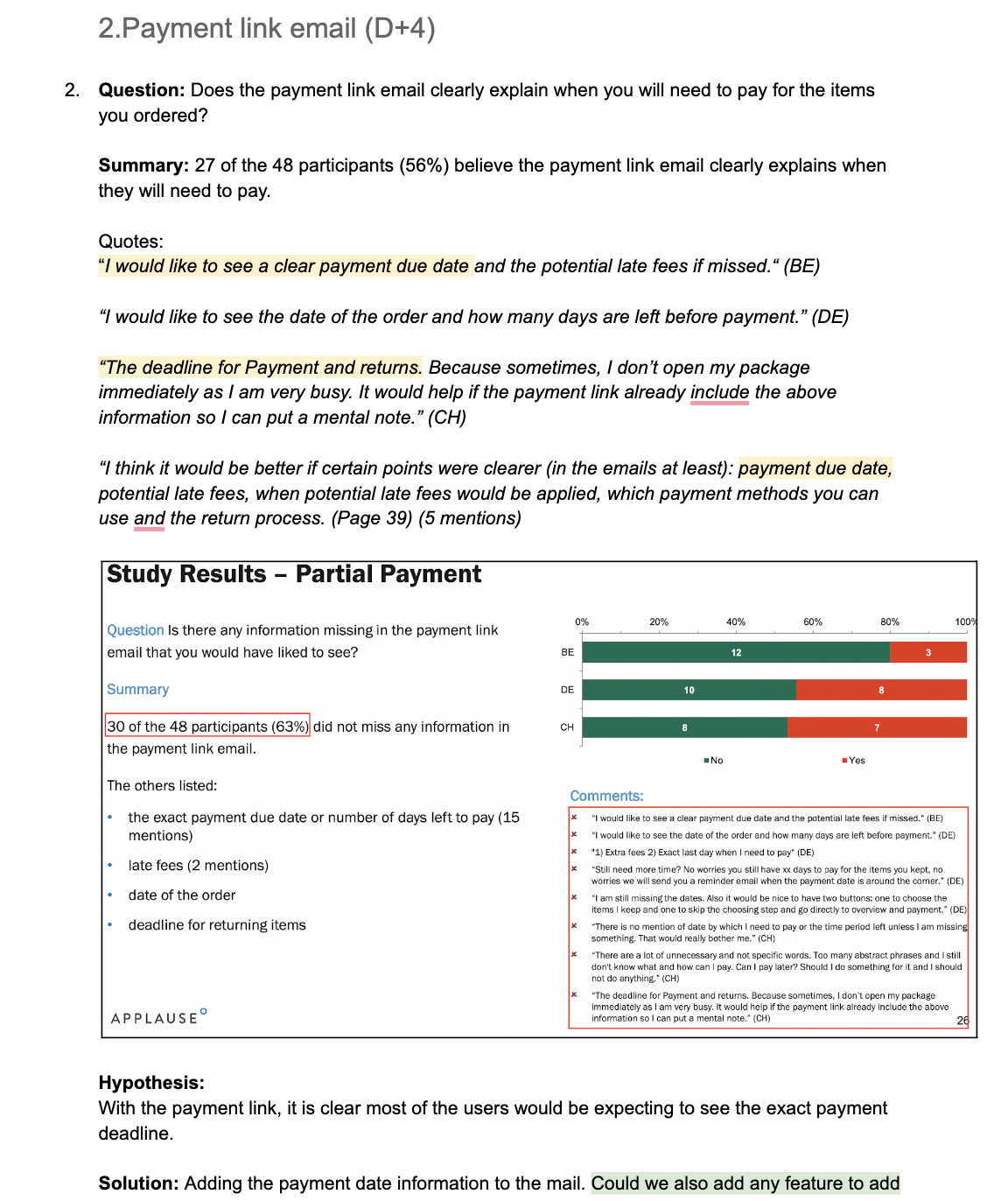
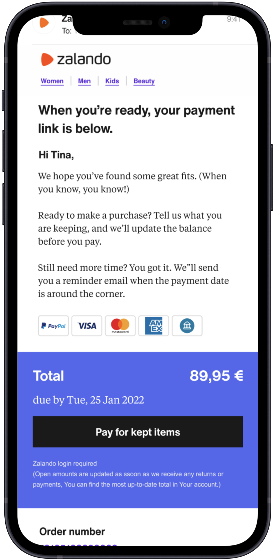
Is there any information missing in the payment link email that you would have liked to see?
Summary
30 of the 48 did not miss any information in the payment link email.
The others listed:
- The exact payment due date or number of days left to pay. (15 mentions)
- Late fees (2 mentions)
- Date of the order
- Deadline for returning items
Key
Quotes
💬
"I would like to see a clear payment due date and the potential late fees if missed."
P-BE
💬
"There is no mention of date by which I need to pay or the time period left unless I am missing something. That would really bother me"
P-CH
💬
"The deadline for Payment and returns. Because sometimes I don't open mz package immediately as I'm very busy."
P-CH
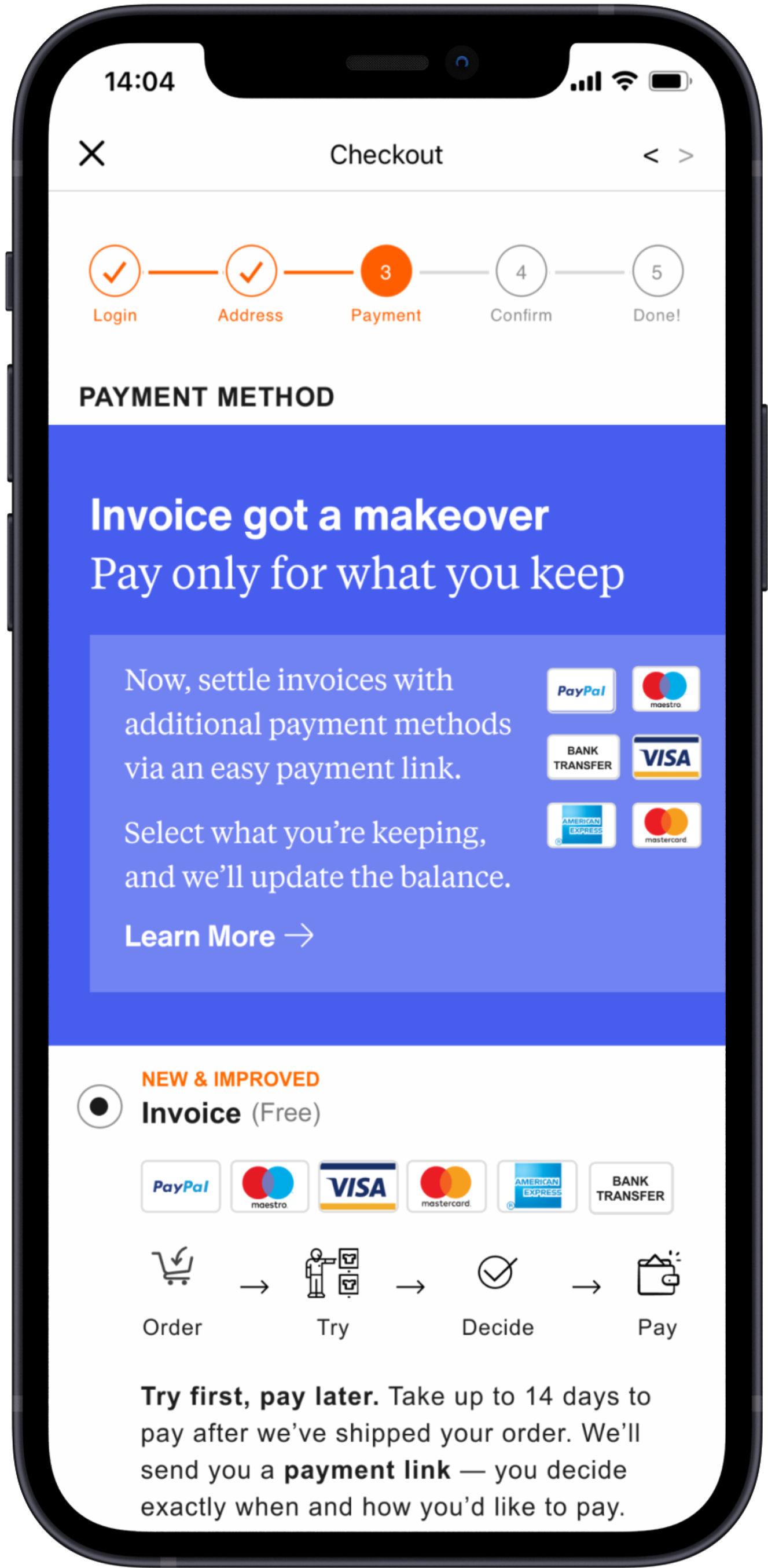
Payment Link - Old Version
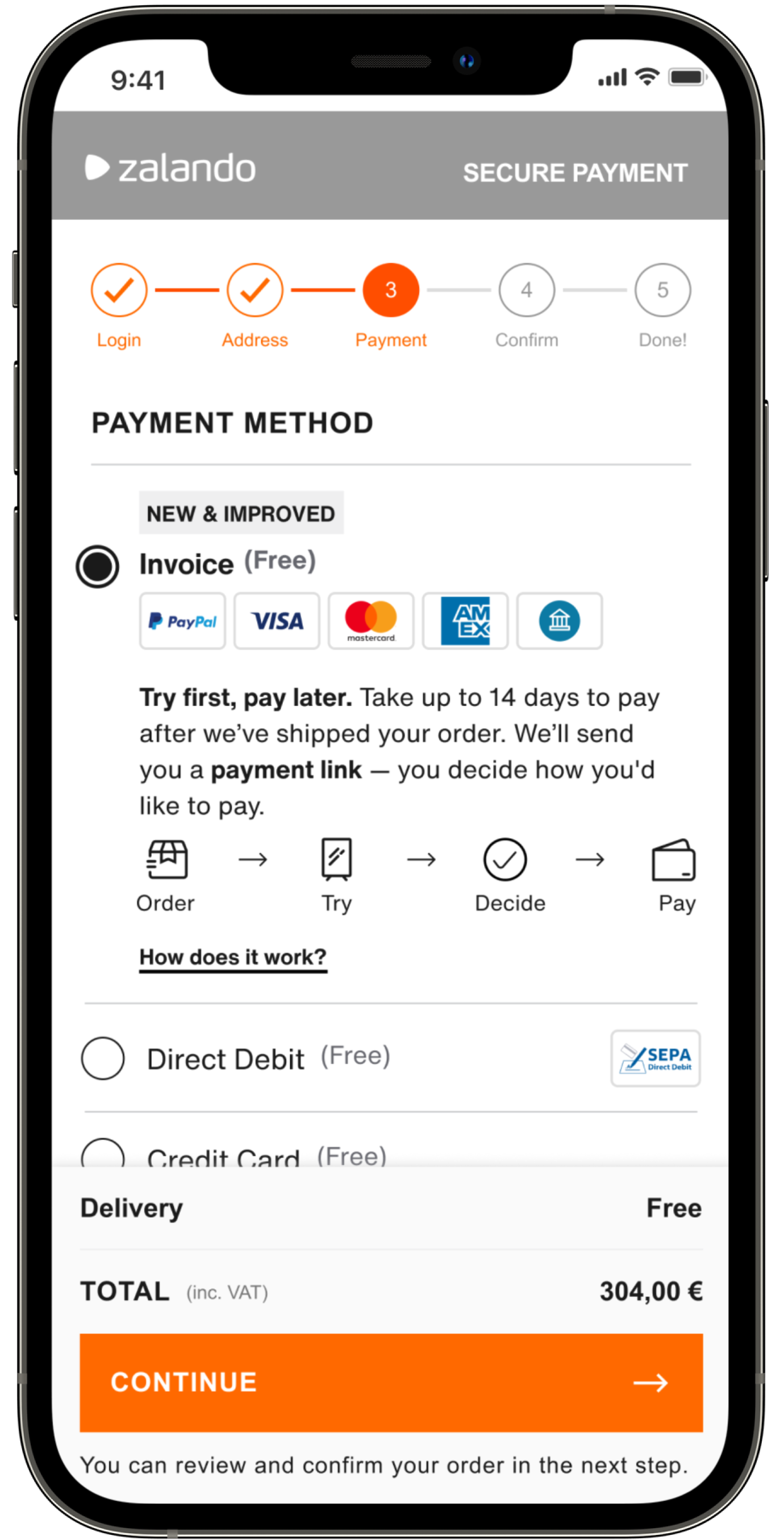
Payment Link - New Version
#Discover
Situation
Buy Now Pay Later has many different scenarios and these are pretty complicated time-wise.
Tasks
To create a single source of truth that contains all the necessary information, we've decided to create a CJM.
Activities
I've gone through all the past works, reports, and analyses to gather all information in one place and design an interactive CJM.
Result
The CJM has been shared with the entire team members to have a common ground and provide the most important information.

#Discover
Situation
During the product development process, we realized there might be different touch-points to make BNPL more visible and understandable for the customers.
Tasks
I've started getting aligned with the expertise of the other team members of Zalando B2C designers.
Activities
I've started working on the design explorations with the other teams in Zalando B2C on how to make this experience more seamless for the customers.
Result
The new explorations have been tested and got pretty impressive results and feedback.
Designed
Screen
Homepage
Explorations
Participants noticed and understood the prompt tile, but did not click the text link to learn more.
We can consider having the BNPL landing page link instead of how does it work text link. It's a better way to educate customers to get back in the purchase flow.
Results
Participants noticed the BNPL messages on Homepage.
Participants understood the BNPL message section.
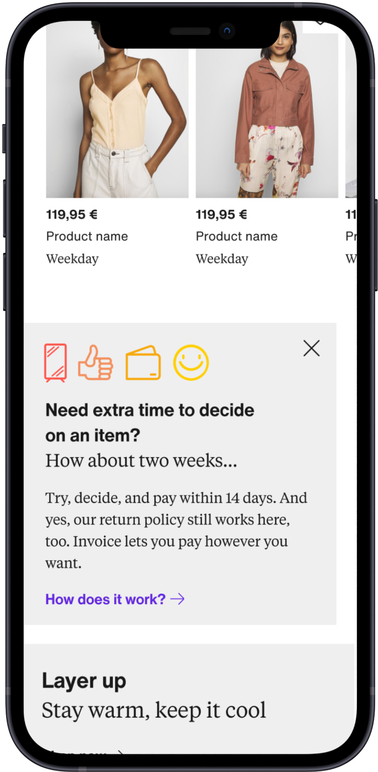
Designed
Screen
Product Detail Page
Explorations
Since the product detail page is considered more by the users, it is aimed to raise awareness by using the bnpl option here.
Results
Participants noticed the BNPL messages on PDP page. 3 out of 5 commented specifically
Designed
Screen
Payment Selection Page
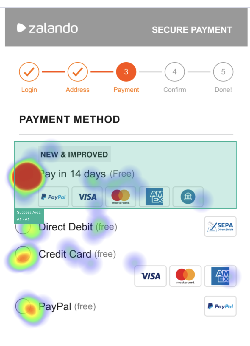
Exploration - Credit Card
Even when the participants did not select the invoice option, we display the message that they can now use their preferred payment method with the invoice.
Results
Participants noticed the BNPL messages on payment selection page.
Participants noticed and clicked on the how does it work text link.
Designed
Screen

Payment Selection Page
Exploration - PayPal
Even when the participants did not select the invoice option, we display the message that they can now use their preferred payment method with the invoice.
Results
Participants noticed the BNPL messages on payment selection page.
#Validation
Situation
BNPL has different names in different markets. Since there are 2 different languages in BE, we wanted to know which name suggestion is going to perform better.
Tasks
I've got aligned with the User Researchers to get consultancy regarding the possible research & validation methods that I would like to use to tackle this challenge.
Activities
After the open hours with the researchers, I've started working on creating the first click test and reviewed it with the product team.
Result
In conclusion, we've got a lot of good insights from the customers about how they perceived the new name and the product.
Task
Imagine you want to buy a pair of shoes. You decide to order 2 different sizes because you're unsure of the size. Which payment method would you choose to make this purchase?
148
Test
Responses
9s
Median time on task
72%
Test
Success


😵
Wrong explaining;
- Confused about how to pay.
- Thinks the money will be transferred automatically.
- Confused about when to pay.
😌
Good explaining;
- Knows that there are 14 days to pay.,
- Knows that they order at first, and pay later.
- Knows they can return before they pay.
🤩
Great explaining;
- Knows 14 days time period starts after the order delivered.
- Knows they can use the other payment methods.
#Design
#Contribution
Situation
Zalando Payment Solutions has a previous design system, and there is no component system for it.
Tasks
As a payments design team, we started having internal workshops to understand how to make our Figma design process better.
Activities
I've started creating all the pages by using the Zalando Design System and creating the component structure of the pages.
Result
The product team has now clear visibility of the Figma file where they can find all the most up-to-date pages.