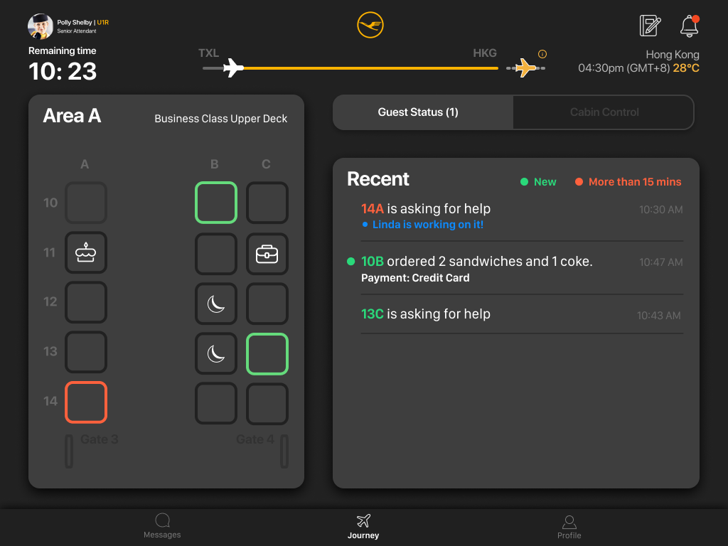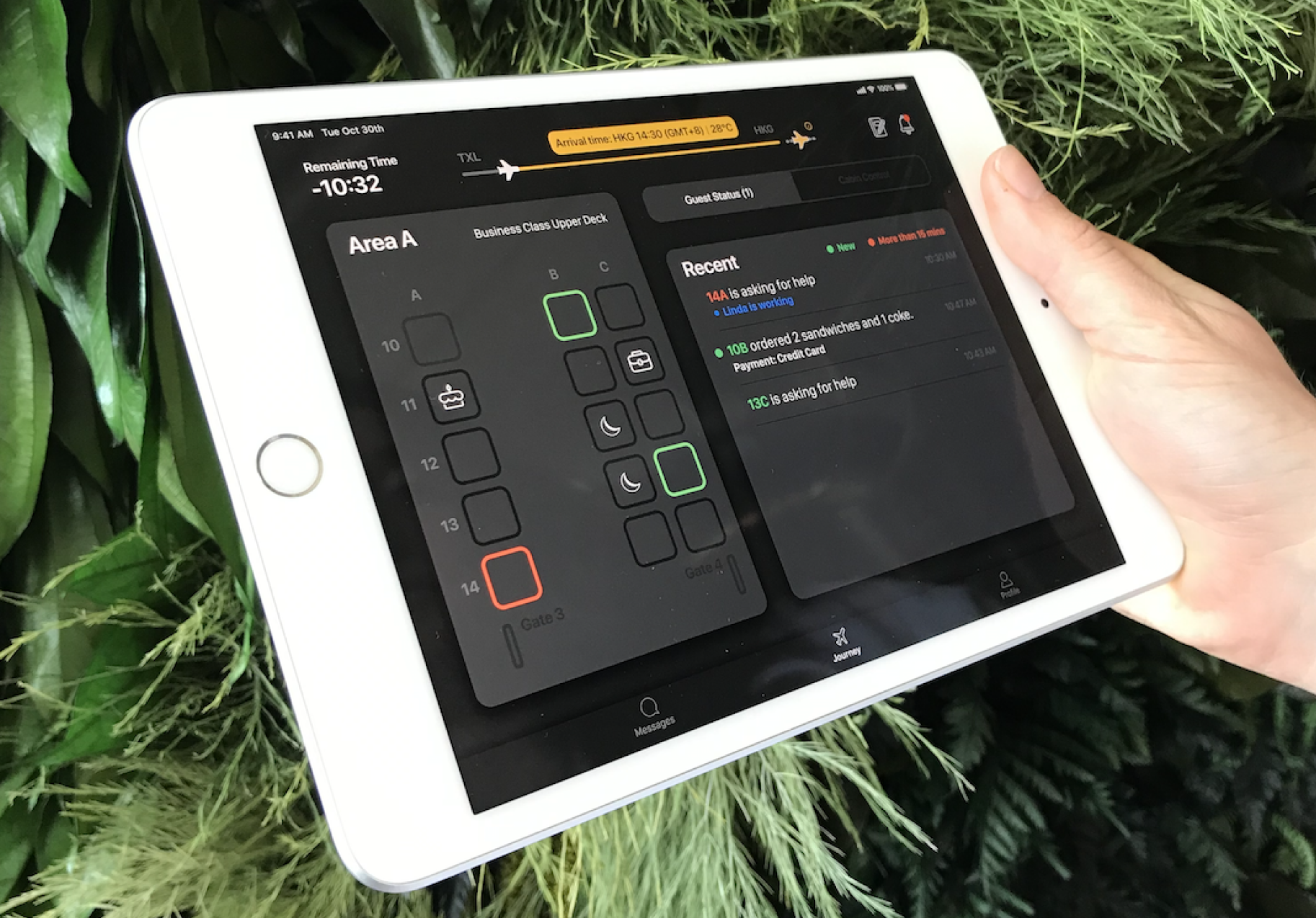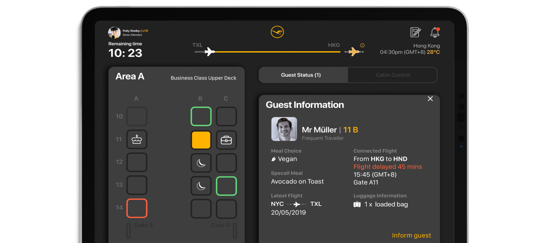
I worked as a design lead for a project with AERQ, a partnership between Lufthansa and LG Electronics. We aimed to design a cabin management tool to be used by flight attendants and airline staff. I played an active role in the research phase, concept design, and customer presentations.
Kick-off Workshop
We started the process by doing a preliminary analysis of the product to better understand the current application interface.
Defining User Stories
After the user interviews, we defined key platform features and set priorities for the design of the dashboard.
Wireframe Concept
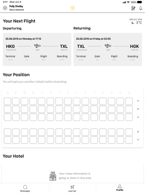
We established the flow of the application with wireframes in Figma.
Usability Test
We conducted user tests to measure the usability of the designed concept.
High-Quality Prototype
After designing the new concept and flow, we prepared detailed prototypes so that users would not have difficulty while using it during a usability test.
First Click Test
During the usability tests, to have quick results, we conducted the first click test by using optimal-workshop and made the iterations of the whole product easily.

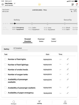
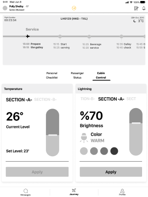
Summative testing helps determine the issues, problems or benefits of an existing or prototype design.


Does the user understand what action(s) they should take and how? (What/How to do)
Does the user understand what will happen after they take the action? Is the intended result clear? (What will be done)
Could user get the feedback clearly? (How?)
Are possible actions clear to the user? (What happens)
Does the user understand what action(s) they should take and how? (What/How to do)
Does the user understand what will happen after they take the action? Is the intended result clear? (What will be done)
Is the information easy enough for the user to access?
Is the information relevant to the user’s needs?
Does the user understand what action(s) they should take and how? (What/How to do)
How many types of information should appear to the user simultaneously?
1-) Availability of the seatbelts.
2-) Inform the gate.
3-) Broadcasting.
4-) Special meals.
5-) Passenger Information.
6-) Temperature regulation.
7-) Connected flight information.
8-) Left behind item.
9-) Crew handover.
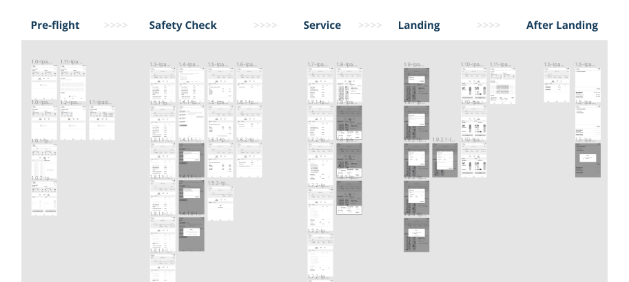
The users can easily understand the structure of the Crew App.
The expectation of the users and the features of the Crew App is matching.
The main functions are easy to understand for the users.
The Crew App is potentially useful for the users.
The Crew members use their device horizontally during the flight.
The font size and the icon set need to be bigger.
The onboarding explanation is a need.
The airline terminology is not matching with the current content.

"It's a little bit unfamiliar, but it's more or less self explaining. I very much like the handover possibility. I very much like the idea adjusting the cabin via my iPad. I like the PAX information area, I know exactly about their information. There is a big improvement from today's perspective. I like the prototype. It needs some improvements."

"This is good! You're doing a great job! No doubts! But you need to know the process and the terminology. If you don't know the process this will take forever. "
Usability
Functionality
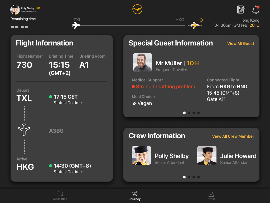
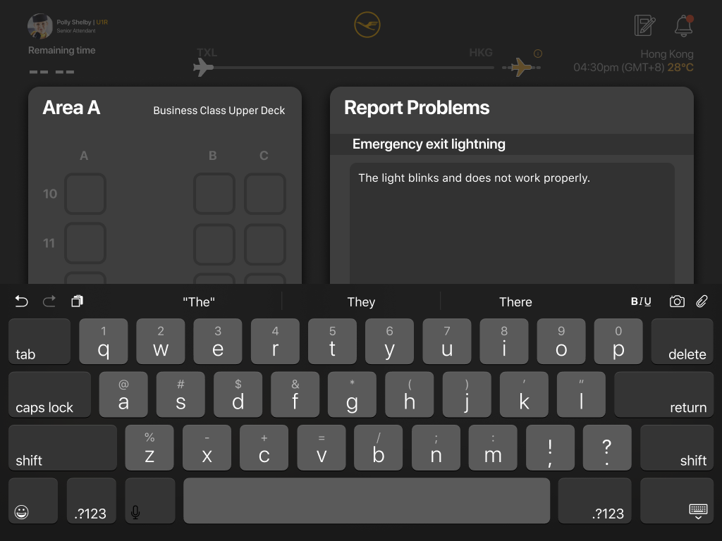


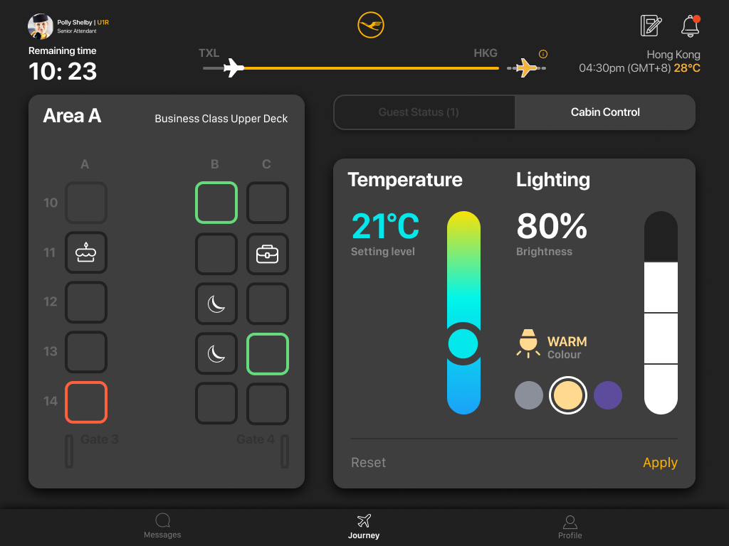
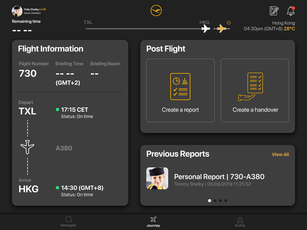
*Summative testing is about determining the issues, problems or benefits of an existing or prototype design.
Task: You want to know if the connected flights are delayed. What would you do?
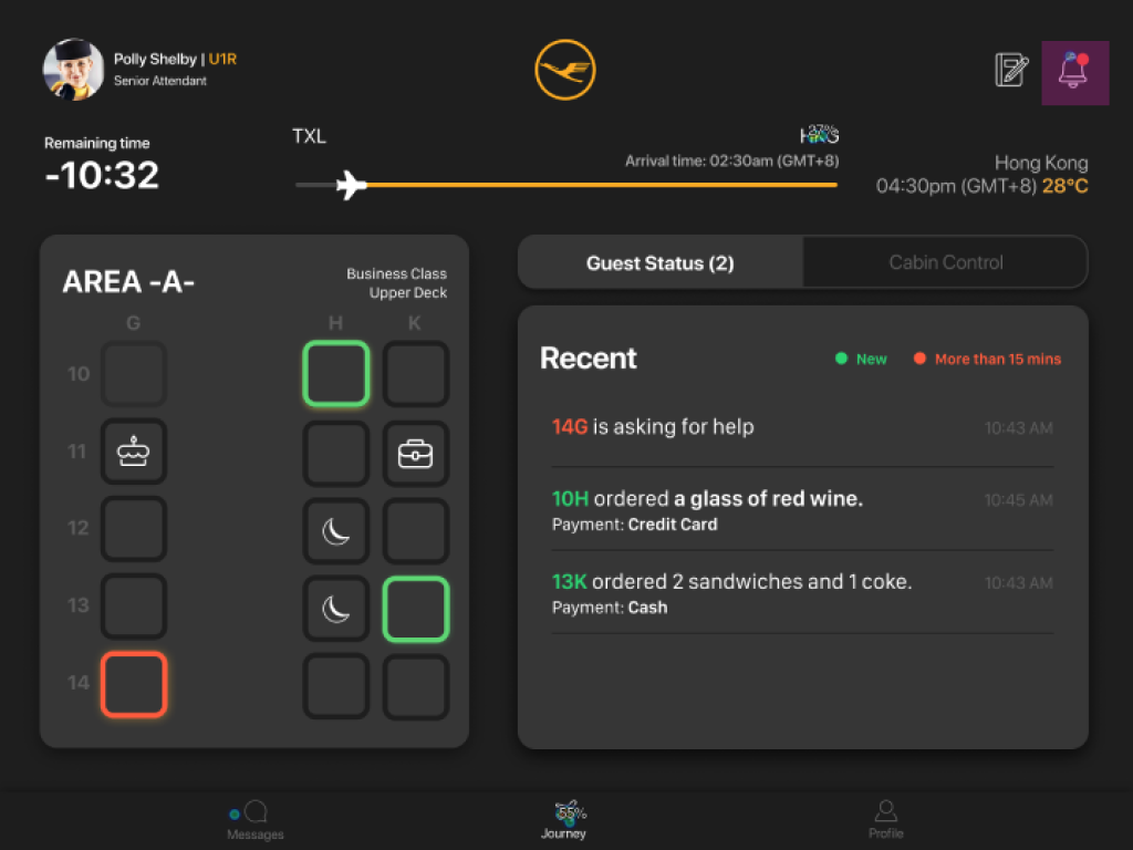
*Summative testing is about determining the issues, problems or benefits of an existing or prototype design.
