
Decentralized finance (DeFi) platform offering hedging mechanisms for digital assets.
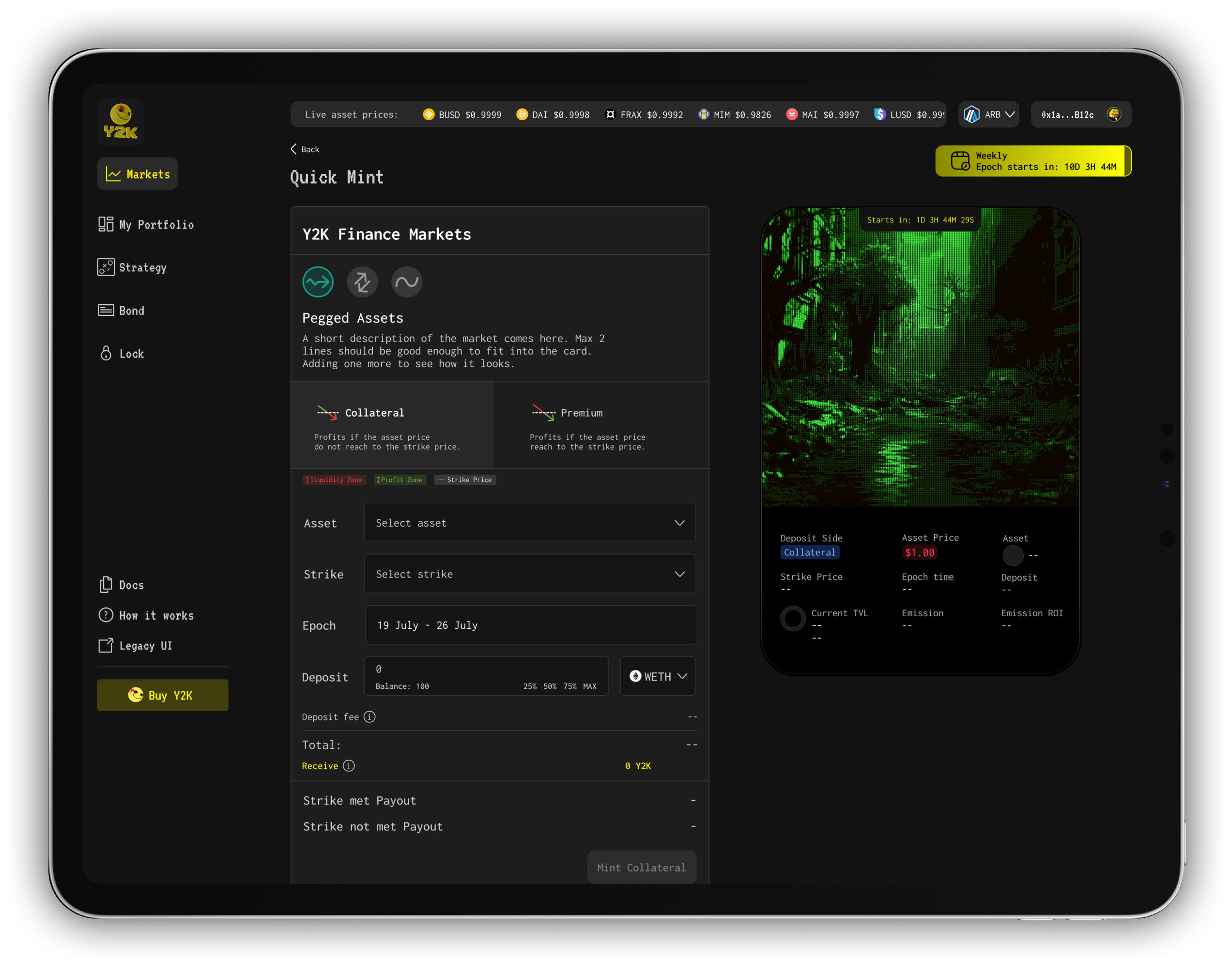
Y2K is a decentralized finance (DeFi) platform offering hedging mechanisms for digital assets. While its early-stage pixel-art UI helped capture community interest, the interface struggled to scale alongside the product.
As the platform expanded with advanced financial features (such as Turbo Options and Vaults), the legacy UI became a bottleneck in terms of usability, clarity, and feature discoverability. My role was to initiate and lead a strategic redesign that could support this growth, align stakeholder expectations, and deliver a more intuitive, scalable, and future-proof user experience.
Team Structure
Product
Managers
Business
& Growth
Developers
Problem
Users had to manually re-deposit into weekly markets. The legacy UI offered no clarity, no automation, and no visibility, hurting retention and liquidity.
My Role
Led end-to-end feature design process from community feedback synthesis, journey mapping, and sitemap planning to flow redesign, UI concepting, and dev collaboration.
Impact
Rollover-related deposits increased by ~28%
Reduced support friction & confusion
Team adopted more design-thinking-driven processes
One of the hardest design challenges I’ve tackled turned into one of the most scalable UX solutions on the product.
Workshop -Product Map
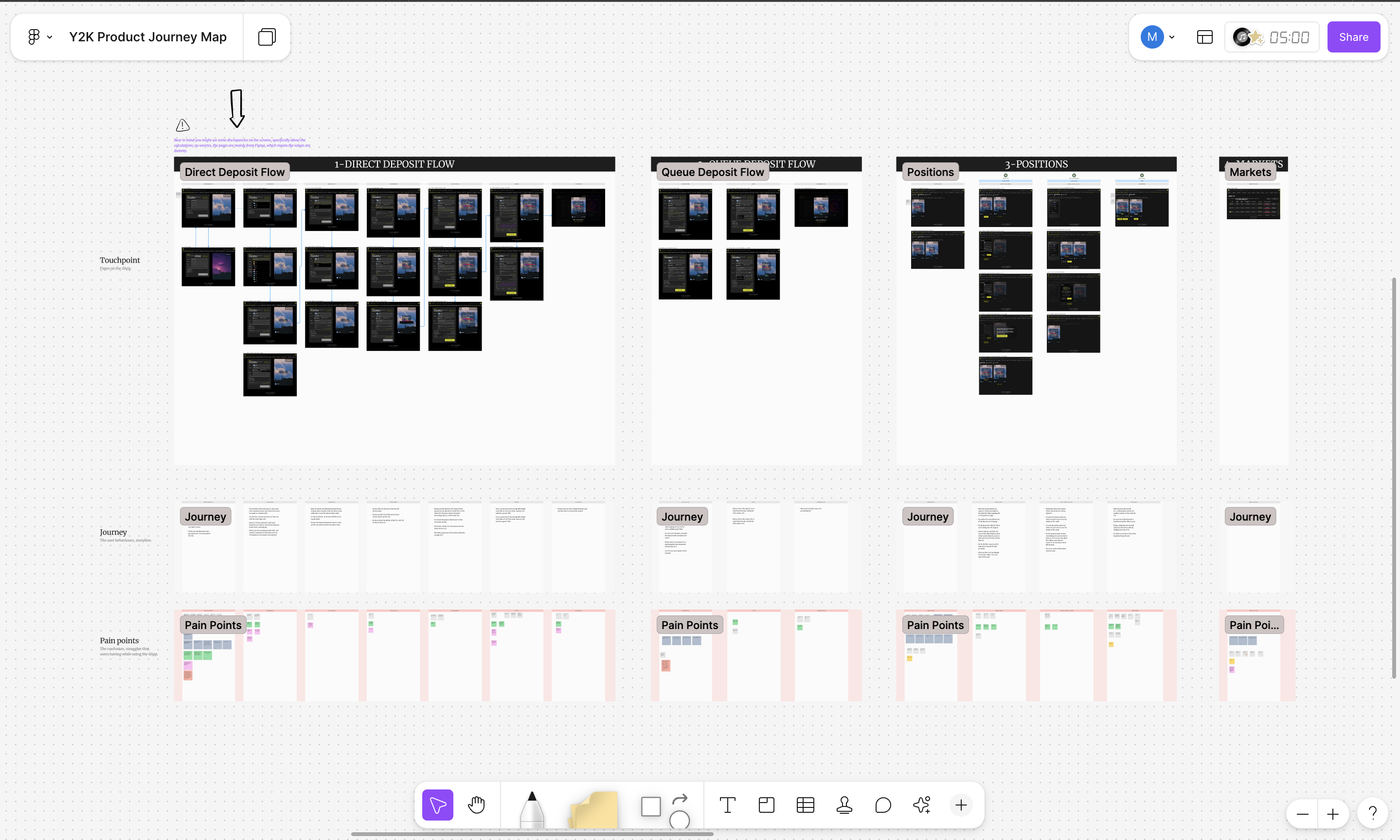
We ran a full-team FigJam workshop with stakeholders across Product, Engineering, and Business to analyze the legacy UI flows. Pain points were clustered into themes like “Market Comparison,” “Portfolio Understanding,” and “Position Feedback.”
Netrographic Research
User insights from Discord and usability heuristics pointed out key issues such as unclear market details, repetitive actions, and discoverability problems, especially around epoch-based deposits.
Sitemap & Wireframes
We introduced a new flow for “Rollover,” solving manual repetition. Users could now commit to multiple epochs in advance, saving time while improving product stickiness.
Dev Handoff
Worked with another designer to build a design system that ensured scalable, consistent UI. Provided specs, component tokens, and detailed flows for engineers to implement easily.
Usability Validation
Tested prototypes with early adopters and received confirmation that users were able to understand and use the Rollover feature without additional instructions. The new market info display increased trust and confidence.
#Validation
#Test
Context
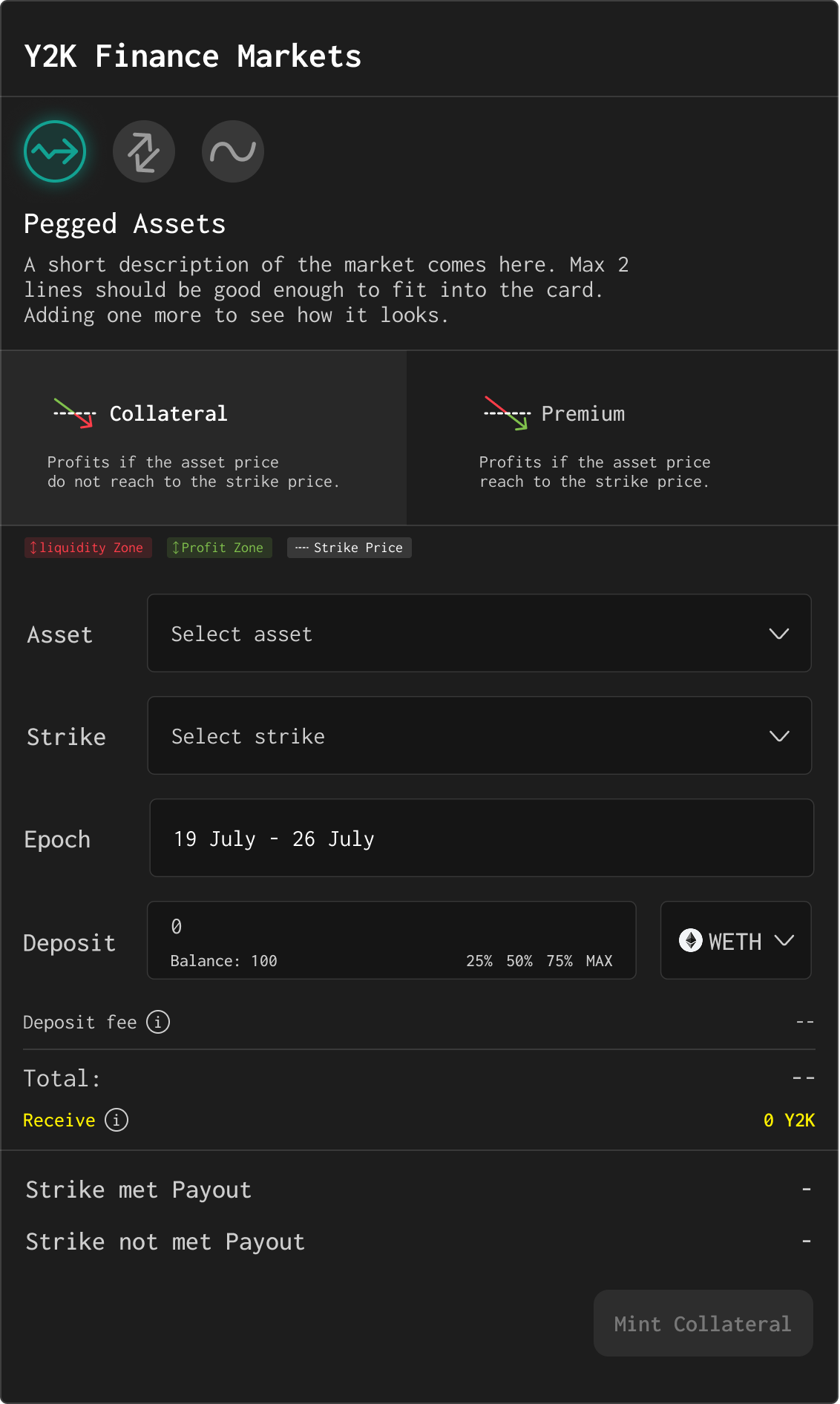
The Rollover feature was designed to simplify the recurring process of opening positions in weekly DeFi markets.In Y2K, users could mint into two opposing sides of a prediction market each week (each “epoch” lasting 7 days)
Collateral: A bet that the asset will stay below a threshold (e.g., USDC stays under $0.9900)
Premium: A bet that the asset will exceed that same threshold
Here’s how it worked:If 10 users deposited $10 into Collateral, and 2 users deposited $10 into Premium, the total pool was $120.
If the Collateral condition held true, the $20 from the Premium side would be redistributed proportionally to the 10 users on the Collateral side (earning $2 each).
If Premium won, those 2 users would split the entire $100 from the Collateral side, earning $50 each.
The system worked, but it required manual interaction every single week, with no option to automate position renewal.
Despite the logic being sound, the user experience fell short, especially for more committed or long-term users

User side
Manual burden: Users had to remember to deposit again each week to stay in the market.
Missing context: The legacy UI didn’t clearly show basic market-level information like previous epoch performance or upcoming thresholds.
Discoverability issues: Users were unsure if their Rollover was successful or even triggered, there was no feedback or state-based guidance.

Business side
Rollover adoption meant more capital locked into the protocol ahead of time, improving TVL (Total Value Locked).
Encouraging users to set future epochs would increase predictability and liquidity.

Technical side
The legacy infrastructure was not built with automated logic or UI feedback layers, making it hard to communicate Rollover status across epochs.
#Discovery
🔎 Community Signals
While exploring improvements for the Rollover experience, I collected direct feedback from active community members on Discord. These power users and early adopters regularly participated in weekly epochs and shared their pain points around both visibility and actionability:
Some representative quotes:
I’d like to see historical oracle price data—not just the current snapshot.”
“I want to compare yields across all markets before choosing which to roll into.”
“I wish I could see past epoch performance and payouts in one place.”
“Rollover, Queue, Edit, Delist—these controls should be together in one screen.”
The overall message was clear:
Community wanted more context, more control, and less fragmentation when managing recurring positions.
As part of the earlier journey mapping workshop, we examined user paths related to Depositing and Rollover interactions. We found:
Missing visibility
Users lacked access to essential market history (TVL trends, depeg probabilities, ROI estimations).
Disconnected decision flow
The data users needed to make informed decisions was scattered or completely unavailable.
Action fragmentation
Users had to move between different screens to queue a position, set a rollover, or delist a market hurting usability.
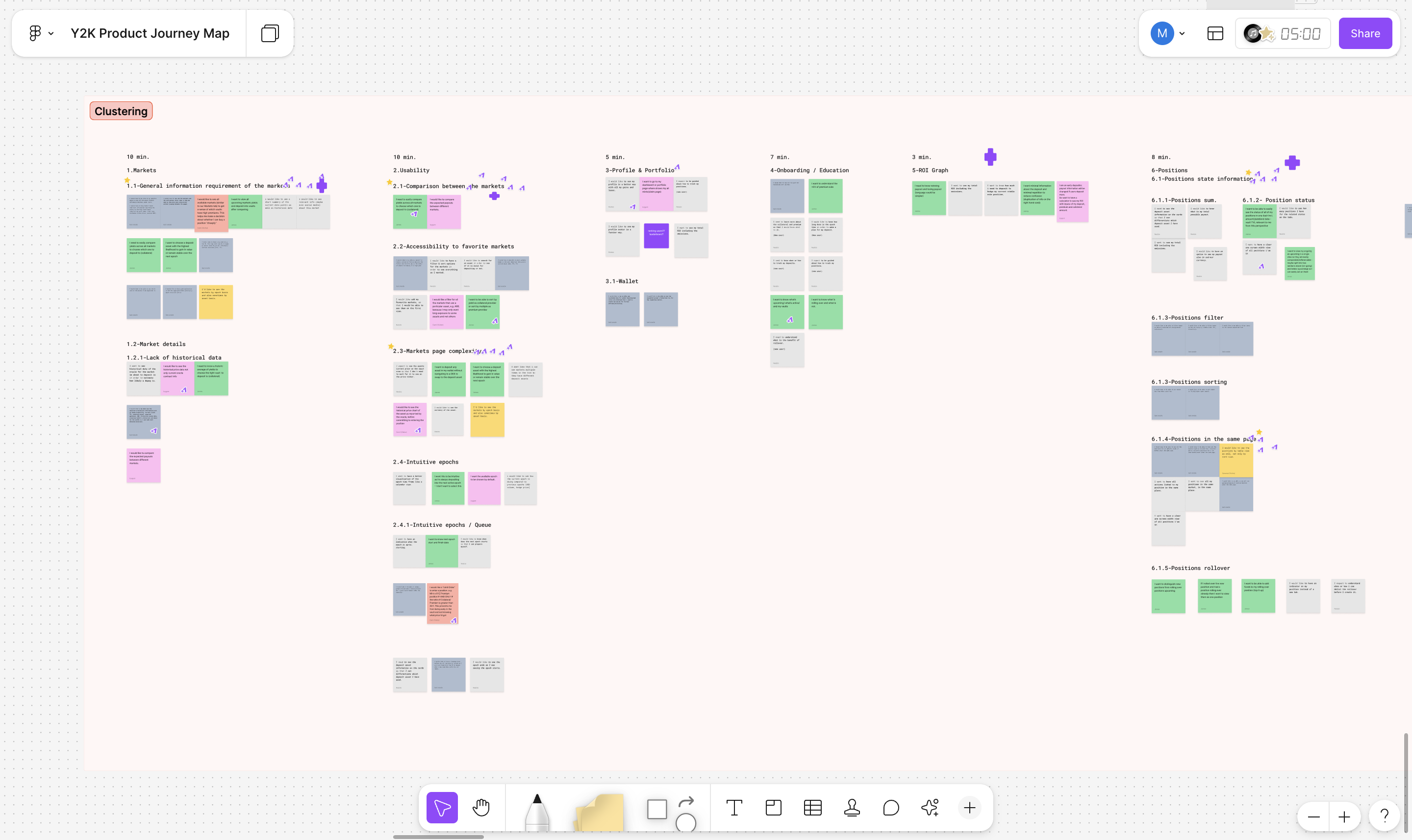
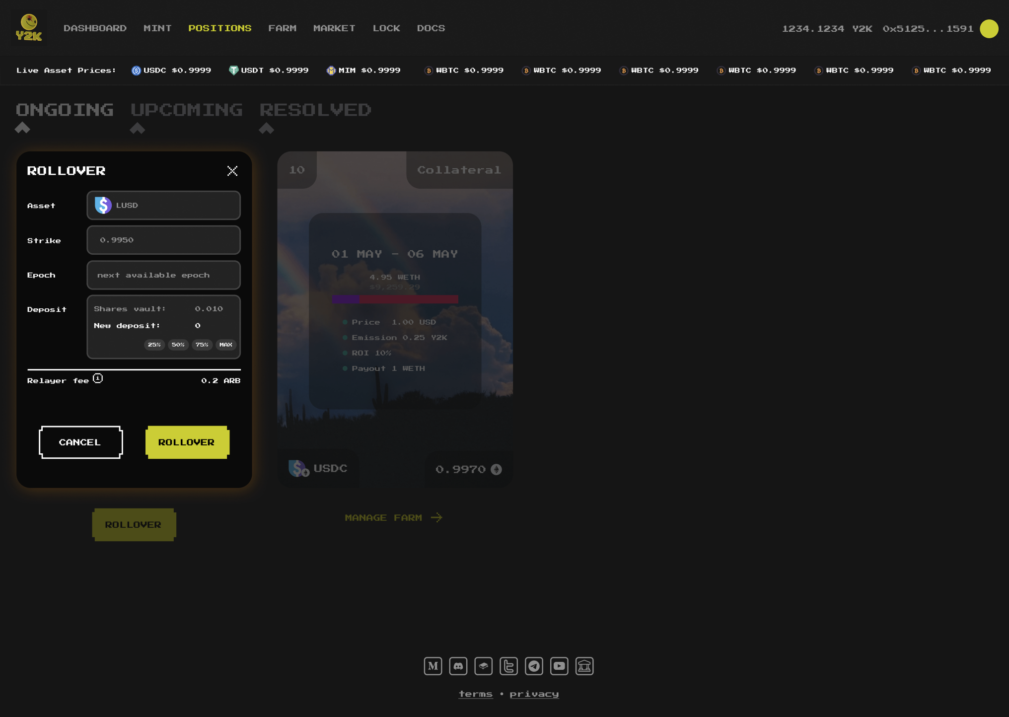
Instead, users had to manually re-deposit every week through the same flow used for first-time deposits, leading to repetitive behavior and frustration.
While the feature technically existed, it failed to meet user needs. The legacy UI lacked both visual clarity and interaction support to guide users effectively.
Key information such as historical oracle data, market performance, rollover state, and comparison across epochs was either missing or buried across different screens.
From a visual and interaction design standpoint, there was no clear mental model for how to manage or automate future deposits — a critical usability gap for a feature meant to save time and reduce friction.
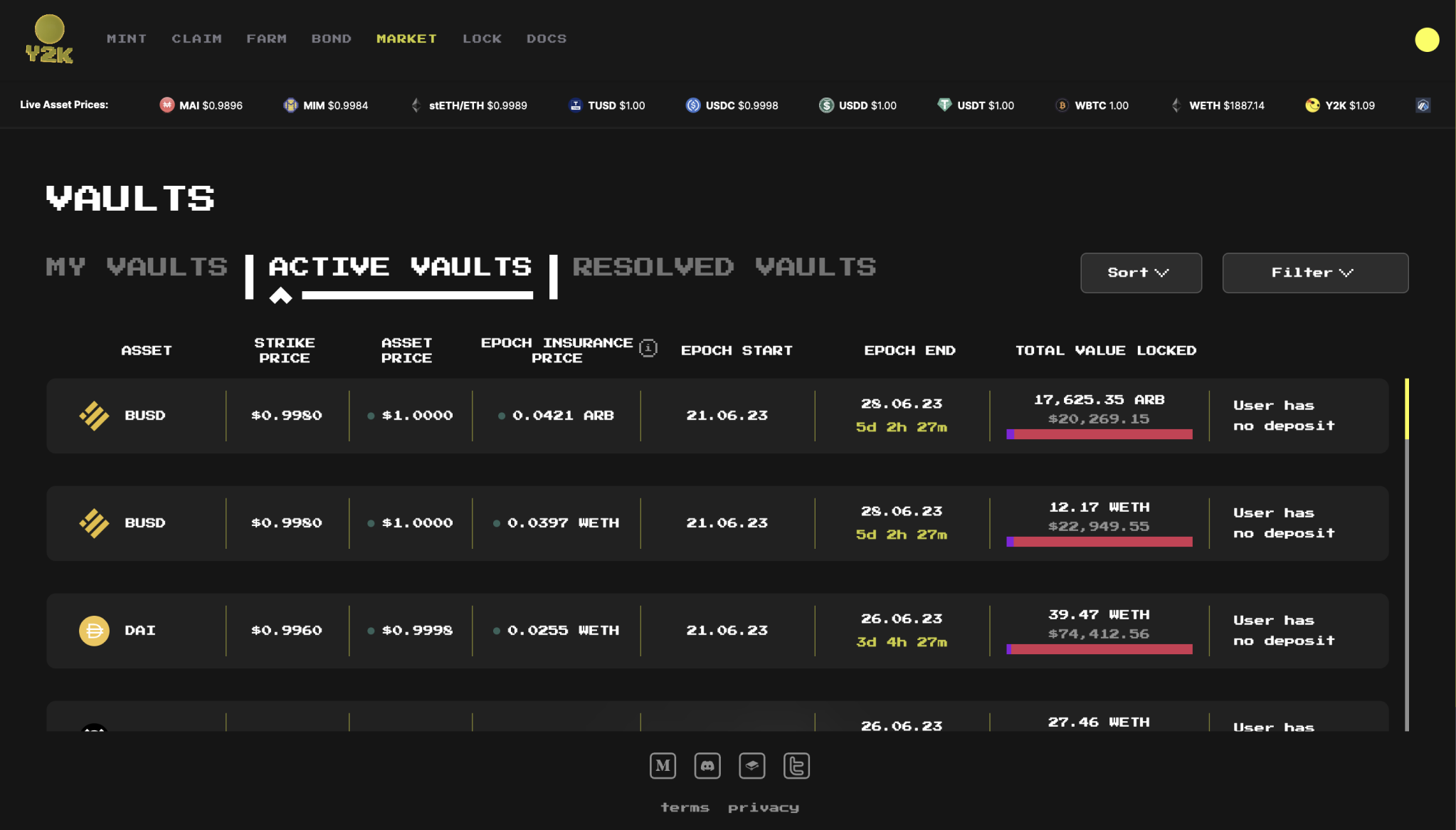
The Markets page was overly dense, lacking hierarchy and clarity.
No indicators or progress visuals helped users understand what stage their positions were in.
No way to “trust” that a Rollover was scheduled or completed—creating uncertainty and reducing engagement.
💡
Community were asking for clarity, control, and continuity over what they were already doing manually. This shifted the challenge from “adding a button” to designing a reliable, context-rich flow that simplifies and encourages participation in Rollover.
#Discovery
Designing the Rollover flow turned out to be one of the most complex design challenges I've faced. The goal was to strike a balance between flexibility and simplicity, all within the constratints of a dense, data-driven DeFi product.
We began by asking:
Where does the user expect to trigger Rollover?
We mapped entry points acroll the platform, from My Portfolio, to Market Details, to Strategy to ensure contextual accessibility. Then, we outlined the essential data and actions users needed to make decisions:
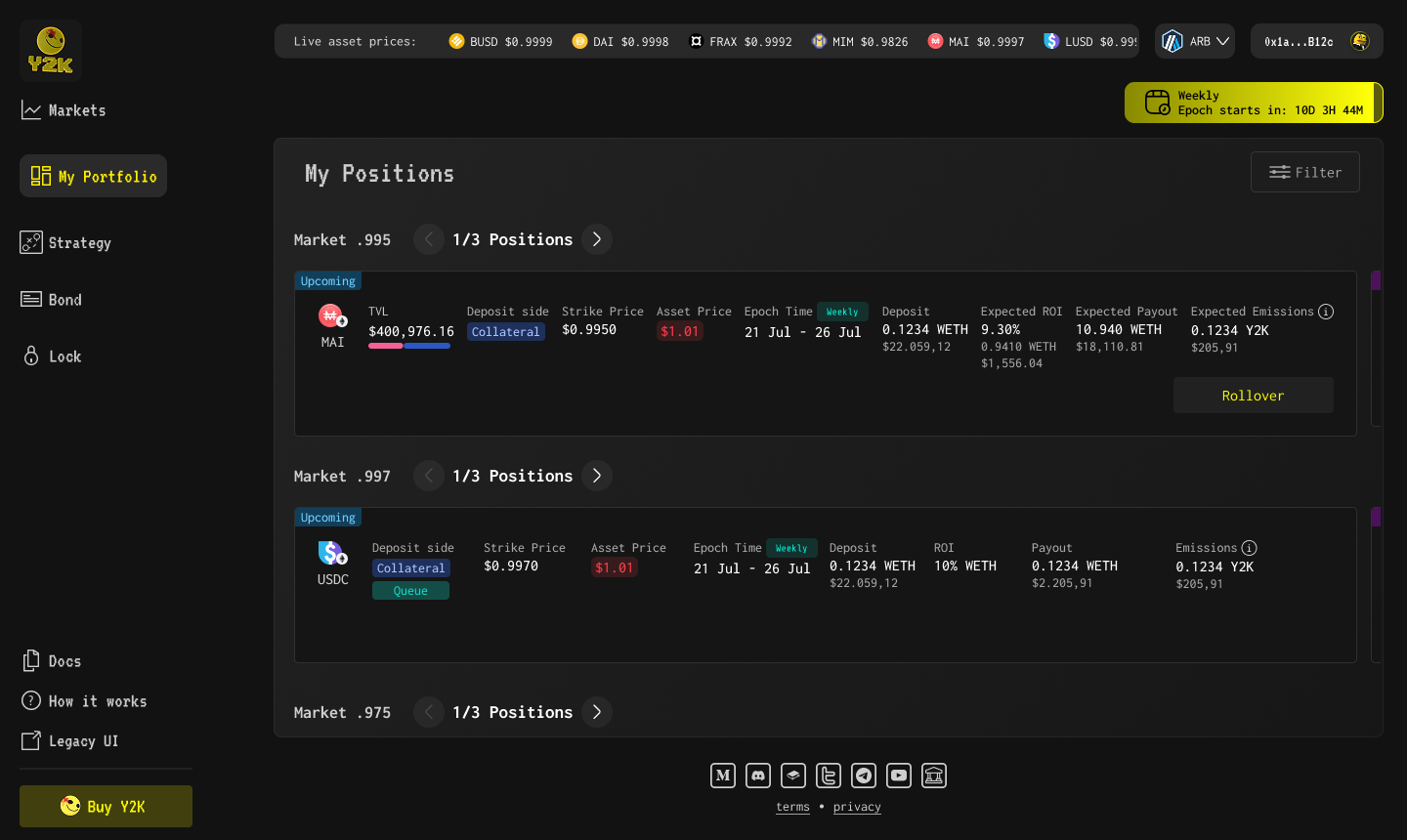

We considered building a full page, but opted for a modal structure instead.
Here is why?
Context preservation: User could easily go back to where they started
Reduced friction: Less navigation, more focus
Quicker interaction: Better suited for high-frequency users
We then built the flow step-by-step with modular components:
Rollover Modal: Split into "Your Original Position" and "Your Rollover Position"
Dynamic controls for inputs
Real-time calculation of ROI, Emissions, Relayer fee
Visual feedback
Badge system added to indicate
Rolling Over
Queued Over
Won
Liquidated
Delisted


.png)
#Discovery
Users immediately found the new Rollover modal intuitive, thanks to its inline placement within the portfolio view and consistent badge language across the app.
Entry points mapped during the design phase proved accurate users triggered Rollover primarily from Portfolio and Market Details, confirming the sitemap placement and access hierarchy worked.
Badge indicators (Rolling Over, Queued, etc.) were frequently mentioned by community members as helpful in understanding position states across epochs.
“I love that I can finally just queue my position and walk away, feels solid now!”
Community member on Discord
#Discovery
Product Impact
The redesigned Rollover experience made it easier for users to stay engaged with Y2K’s prediction markets across multiple epochs—without needing to start over each week.
The new modal simplified a previously manual and error-prone flow
Data clarity (TVL, ROI, emissions) helped users make more informed decisions
Badge indicators and contextual UI reduced friction and increased confidence
As a result, weekly deposits via Rollover increased by ~28%, improving liquidity and user retention
My Impact
Beyond the feature itself, this project helped drive broader design maturity within the team:
Introduced structured UX methodologies such as journey mapping, sitemap planning, and heuristic evaluation
Facilitated cross-functional alignment through collaborative FigJam sessions
Brought design thinking into product planning, helping engineers and stakeholders better understand user needs
Established modular component-based thinking for UI decisions, still reused in other parts of the platform
Fostered a shared design language between design, product, and engineering